We're three weeks deep into the best 14 weeks of the year: full of football, playoff baseball, basketball and (hopefully) hockey. But I could really care less about the scores - the BCS will find some way to pit Alabama against LSU again this year, in the "who really cares anyway" championship game - I want to see what Oregon will wear, or which uniform combination Arizona State, Oklahoma State or Maryland will wear. I want to see the throwbacks Wisconsin and Nebraska are planning for next month.
I want to watch crisp-looking teams play close, exciting games.
Thus far the Bulls have gone toe-to-toe with a college football powerhouse and a team with one of the most entertaining college marching bands in the country. The results would be much as you imagined. Buffalo played Georgia tough on the road, but failed to pull the upset. The Bulls then put up one of the most prolific offensive games in school history against Morgan State. But the battle for best-looking team has gone a little differently.
The Bulls went with their all-white uniforms against Georgia, who has some of the best-looking uniforms in the country, and looked fit to play a Southeastern Conference opponent. I still maintain this the Bulls crispest look. The Bulls even elicited a few boos from the Georgia faithful, which I like to believe is because they just looked that much better than the Bulldogs.
The Bulls routed Morgan State, both on the scoreboard and in a fashion sense.
Buffalo wore their best home look, blue over white. Not that there is anything wrong with the mono-blue look, but it just doesn't look as crisp as blue and white do together. And don't even get me started on those black pants. Morgan State, however, dressed like an FCS team.
Morgan State's biggest mistake is being outfitted by Russell Athletic. Russell just doesn't do many big-time college programs, and you can tell when you look at the Bears' uniforms. Morgan State's helmet looks good enough incorporating its school logo with both its school colors onto a white background, but once you get to the Bears' jersey, it's all downhill.
If they had simply stuck with orange and white, maybe this look would have been salvageable. But they decided some sort of odd faded checkerboard pattern had to be added to the shoulders, and it looks terrible. Junior wide receiver Alex Neutz didn't need any help looking totally dominant over the Bears secondary, and he certainly managed to look significantly better than his opposition while doing it.
Next up, Buffalo begins their conference schedule, in which they will look to prove that they are not only the best team in the Mid-American Conference, but also its best-looking team. Kent State is as much of a uniform cupcake team as you can find.
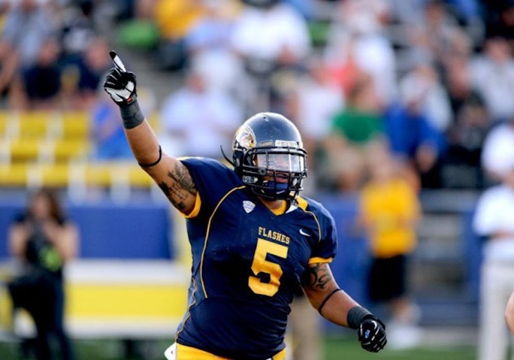
The Golden Flashes' biggest problem is their gold on navy color scheme; it's a hard combo to make look good. Their second biggest problem is they seem to be the only team in the country to not get a modern look from Nike with their latest rebranding.
As recently as 2009, New Balance outfitted Kent State. The Golden Flashes switched to Nike in 2010, and although they certainly look better now than they did before, there is still a lot of room for improvement.
Starting with their away jersey - since that is what they will wear when Branden Oliver and company attempt to embarrass them on national television - you can already tell that they need work. Kent State failed with its admirable attempt to go with white on white two weeks ago. Not only did they lose, but they looked pretty bad doing it. The major problem here is the helmet. It's dark, too dark to wear every game, especially if you aren't going to wear dark pants. Their logo doesn't help - there's too much going on. A simple "K" would suffice, but instead they have a "K" with an eagle coming out of a lightning bolt surrounding it. I don't get it.
Kent State's jerseys are its next biggest problem. Continuing on the trend of trying to do too much, the jerseys are just too busy. The piping that separates the shoulders from the body of the uniform is a Nike template design and even though it may be recent, it looks old. The Golden Flashes' jerseys didn't stand up against a Kentucky team that had their uniforms freshly rebranded last season. They looked muddled and sad compared to the fresh blue and white of Kentucky, very similar to what will happen tonight.
Kent State's home jerseys aren't much better. Although the dark helmet looks better with the navy jersey, the piping still muddles the look. The only difference is that the piping on these jerseys is gold, which looks even worse than the navy piping on the white jerseys. The gold numbers are a darker shade of gold, which doesn't help things much.
The jerseys are just plain dark. There is no element of the jersey that pops off, and that is the main factor in what ends up as a cluttered look. There are no defining lines of color and the whole thing blurs together.
It's pretty easy to hate on MAC teams, considering the Bulls' recent record against them. But when you look as bad as Kent State, it's almost too easy. Even if the Bulls can't beat Kent State tonight, fans can take a little comfort knowing Buffalo is the far-better looking team. It clearly spells more future success if uniforms are as large as a recruiting factor as we are led to believe.
Email: sports@ubspectrum.com
 Photo: Courtesy of UB Women's Rugby

